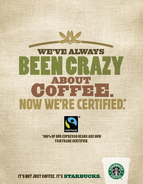
In one of my earlier blog posts, I shared how unimpressed I was with Starbuck's new ad campaign. In that entry, I proposed a redesign that would be more effective and would appeal to a larger audience. As one of my projects in another college design class, I took that proposition and actually created a different ad for Starbucks.

In my redesign, I wanted the focus of the ad to be on the products that Starbucks offers. Images are powerful. It is much more difficult to resist the temptation of a steaming hot, decadent white chocolate mocha when a visual representation is before your eyes. Especially if you happen to be chilled to the bone. The image stirs a craving that can easily be satisfied by pulling up to a Starbucks.
I was inspired by an old, and I mean really old, song entitled "I've Got My Love to Keep Me Warm." In this case, the source of warmth radiates from the Starbucks coffee cup. The deep red is a stark contrast to the cold scene in the background, and the cup provides bright colors to an otherwise dreary landscape. The eye is immediately drawn to the coffee. The text complements the featured product, and does not distract but rather adds to the image without overpowering the ad.
Contrasting the two ads: one is inviting, mouth-watering, and classic. The other is bland, blah, and relies on text to convince people to purchase expensive coffee. It is easy to see which one would be more successful.
I like the first ad, the second is crap.
ReplyDeletegrtz.
Jurgen