Saturday, October 31, 2009

Wonder Ink

I will be the first person to admit that I am not a technology whiz. I am constantly bombarded by terms that fall in one ear and out the other. And being a naturally curious sort, I usually decide to do some investigation in order to enlighten my ignorance.

E-ink happens to be one of those definitions that I am somewhat hazy on. I have a general idea of what the word means, but until today, I didn't grasp the full implications of its properties. And after reading up on e-ink, I find that I still don't comprehend it completely...

Electronic ink is a proprietary material that is processed into a film for integration into electronic displays. Although revolutionary in concept, electronic ink is a straightforward fusion of chemistry, physics and electronics to create this new material. The principal components of electronic ink are millions of tiny microcapsules, about the diameter of a human hair. In one incarnation, each microcapsule contains positively charged white particles and negatively charged black particles suspended in a clear fluid. When a negative electric field is applied, the white particles move to the top of the microcapsule where they become visible to the user. This makes the surface appear white at that spot. At the same time, an opposite electric field pulls the black particles to the bottom of the microcapsules where they are hidden. By reversing this process, the black particles appear at the top of the capsule, which now makes the surface appear dark at that spot.

To form an E Ink electronic display, the ink is printed onto a sheet of plastic film that is laminated to a layer of circuitry. The circuitry forms a pattern of pixels that can then be controlled by a display driver. These microcapsules are suspended in a liquid "carrier medium" allowing them to be printed using existing screen printing processes onto virtually any surface, including glass, plastic, fabric and even paper. Ultimately electronic ink will permit most any surface to become a display, bringing information out of the confines of traditional devices and into the world around us.

E-ink in a nutshell. The implications of this wonder-ink are still beyond me. It has the potential to impact the world on multiple levels. Unhindered by ink's barriers, e-ink can revolutionize the ways that people display information. It is mind-blowing to consider. I also find it rather exciting. And very 'green'. If e-ink can be produced in such a wide range of surfaces, the need for paper forms of advertising would be greatly reduced.

I know one thing: my children are going to grow up in a vastly different world. At the rate that things are changing these days, I am certain that I will have a host of stories that I will be able relate to them. I can envision their surprise as I tell them about a clunky, rectangular plastic box that used to be inserted into an ancient device called a VCR in order to watch a movie. And how Pluto was considered a planet when I was a child. And I am sure that most of the technologies my children will take for granted are going to continue to make me marvel...I will think back on how far we have come. At this point and time, I do not think that physical, paper books will become distinct, though I do think that they are fading into the background as our digital technologies overshadow them.

Finding My Voice


I have reached a conclusion: seeing as this is a blog, after all, I am going to start to attempt to 'find my voice'. Personally, I think that phrase is somewhat ridiculous, but as I've started to follow several blogs now, I realized that the reason I find them so engaging is due to the fact that they don't just spit out re-hashed information. Their appeal lies in their originality of thought and ideas. So I don't know what kinds of original thoughts and ideas lay buried in my mind, but the successive blogposts are going to be an attempt to bring whatever I have to the surface. It should be an interesting process... At the moment, I haven't the faintest idea as to how these posts are going to begin evolving.

image: deviantart

Thursday, October 29, 2009

Jeans - America's Trademark


Blue jeans are particularly identified with American culture. Comfortable and casual, denim jeans are a clothing item that people cannot seem to do without. It was Levi Strauss, a German-Jewish dry goods merchant, who began selling blue jeans under the name "Levi's" to mining communities in the 1850s. These durable denim jeans were well received, and demand for the product increased. By 1890, Levi Strauss & Co. became an official corporation.

Since that time, the popularity of jeans has swelled. Up until the 1950s, however, blue jeans were viewed as simple sturdy trousers worn by the working class of men. Yet when the film Rebel Without a Cause was released in 1955, James Dean sparked a trend that forever altered the image of blue jeans. Teenagers and young adults took to wearing jeans as a symbol of youth and rebellion.

Jeans have come a long way. The designs have morphed throughout the years. Today, there is a wide variety of assorted styles, washes, fits, and cuts offered for denim jeans. Levi Strauss is still one of the leading brands. Another very popular company, especially among the youth, is American Eagle.

So how do companies effectively market jeans to a population of people who own closets that are stocked full of denim? I suppose it is rather old hat, but the typical answer is simple: they create a need. In actuality, it is more of a want, but composed in such a way as to give the impression of a must-have. Fashions are always changing, constantly shifting, and in order to be cool, people will fork out their hard-earned cash in return for the newest trends.

In the wake of national recession, however, the general public is holding tighter to their money. According to a recent survey put out by Synovate, most Americans do not wish to spend more than $40 on a pair of jeans. This survey also showed that women in particular are more inclined to purchase a pair of jeans that would camouflage their flaws or make them appear slimmer. The quality of a pair of jeans is the leading factor that people look for when shopping for jeans, winning out over price.

The Artist is American Eagle's best-selling pair of jeans. When the company dropped the style in the summer of 2008, they reported a 7 percent drop in overall sales during the August through October period. This year, the Artist is getting star-treatment, serving as the focus of American Eagle's advertising campaign, but it is being priced far below the cost of designer jeans [ranging from $29.50 to $49.50]. "Countless hours in the design studio have perfected the fit so it flatters in all the right places," said LeAnn Nealz, chief design officer for the American Eagle brand, in a statement about the Artist jean. According to the official release, "The new fit has an improved back seat lift with changes in the pocket size and positioning to the yoke of the jean, creating the look of a perky backside."

American Eagle has made the right moves. This season's denim line-up is giving their clientele exactly what they asked for: quality, low prices, and flattering jeans. However, the response is entirely dependent upon the consumers. Is the design of the new and improved Artist enticing enough to win back American Eagle's customer base? Only time will tell...
"I have often said that I wish I had invented blue jeans: the most spectacular, the most practical, the most relaxed and nonchalant. They have expression, modesty, sex appeal, simplicity - all I hope for in my clothes." – Yves Saint-Laurent
sources: http://www.post-gazette.com ["American Eagle's 'Artist' jeans return." Lindeman, Theresa] http://www.synovate.com
images: http://www.ae.com

After having posted this blog entry, I stumbled across this relevant article. According to Christina Binkley of the Wall Street Journal, 'power jeans' are becoming increasingly common in high-ranking business and political circles. She states that jeans are now a legitimate part of the global power-dress lexicon, worn to influential confabs where the wearers want to signal that they are serious - but not fussy - and innovative. You can read the article here

Wednesday, October 28, 2009

Something to Shoot For


Steven Spielberg's 2002 film, Minority Report, featured futuristic technology and computer interfaces. The advanced digital technologies that are shown in the film have introduced new realms of possibilities to the digital community. Spielberg's conceptual vision is serving as a source of inspiration for computer programmers all over the world.


Oblong Industries, a company based in Los Angelos, CA, is the developer of g-speak spatial operating environment, aka SOE. Some of SOE's core ideas bear resemblance to the Minority Report technologies. The similarity is no coincedence. One of Oblong's founders served as a science advisor to Minority Report and based the designs of those scenes in the film on his earlier work at MIT. The impressive technology shown in Minority Report is already making its way into academia. From academia, into popular cinema, and out broadly into the world as commercial product, g-speak has the potential to alter human/computer interface.

g-speak overview 1828121108 from john underkoffler on Vimeo.


I find it fascinating that science fiction, films, and futuristic art spur technological designs. It takes a team effort to produce the finished product, and the initial inspirations come from a wide variety of sources. The visionaries conceive ideas, but it is the producers and programmers who take those concepts and hone them until they get results. Visionaries give the programmers something to shoot for, and the programmers produce actual digital media.

{ Digital Eye Candy }


Adidas is famous for their sneakers and sporty clothing lines, but they have also started a line of accessories. This particular watch caught my eye. The bright colors are striking. Sleek and attractive, the design of the watch is 100% modern and true to the motto of Adidas - long live sport. The colorful digital ‘Candy’ Collection represents the true fusion of Adidas’s sport heritage with metropolitan street style. It is a neat representation of digital eye candy. New technology merges with a traditional timepiece to create a piece of tantalizing eye candy, as it were. The watch is both sporty and cool. The elements of design that have been incorporated into the watch include 5 ATM water resistance, 10 lap memory, timer, and alarm. It is both durable reasonably priced. Adidas' product appeals to their target audience, those who desire to purchase sporty designs.


Penguin is a company that provides digital analog watches. Sleek, fashion forward, these timepieces are much more refined. In contrast to the Adidas watches, these pieces are designed for a different clientele.


It is interesting to note that watches did not begin to see widespread use until the 1920s. Men considered wristwatches to be effeminate. Watches adapted to the wrist made sporadic appearances as early as the late 1500s. Queen Elizabeth I is said to have been given one. In the early 1800s the wristwatch made more frequent appearances when jewelry and watchmakers began creating gem encrusted timepieces for royalty.


Toward the end of the 1800s, women began to embrace the wristwatch as an item of adornment. Despite the feminine association, the concept became accepted as indispensable to military campaigns as mechanization in war grew. The ability to read time with a quick glance rather than having dig through to pockets was critical in battle.

Officers in the South African Boer war (1899-1902) used wristwatches. By World War I, military organizations began to demand them. They became especially crucial to fledgling aerial combat operations.

As demand for wristwatches in warfare grew, rugged timepieces covered with metal grids were introduced. The first chronograph wristwatches were developed, and luminous hands and markers were developed.


Today, wristwatches are worn by both men and women. They come in an assortment of styles, and range from casual to formal. The various designs are created with a specific audience in mind. Now, the technology has advanced to the point where digital analogs are integrated onto the face of the timepiece.


LG has even come out with a watch phone. New Media has combined digital technology with watches. Now your watch can talk. Who can predict what the future holds? Perhaps there will not be a need for watches in 20 years. As our technology advances, our digital devices are morphing and overlapping. Our generation has been dubbed 'the age of convergence'. It is not so difficult to imagine a time piece as a tiny chip inserted under a layer of skin. It could be that our watches of the future actually become a part of us. Keeping track of time could not be easier. It is an interesting concept...

Tuesday, October 27, 2009

Reflections...

What makes movies successful? More than any other factor, the bottom-line narrows down to how well the film tells a story. Audiences flock to films that resonate with meaning. As I've stated in this blog before, people love to hear a good story. It should come as no surprise that Pixar, a studio that focuses on delivering films that weave well-crafted stories with state-of-the-art animation, has dominated at the box office. Their latest release, Up, features a 78-year old protagonist named Carl Fredrickson. Cantankerous and, well, old, Carl is stiff in the joints and not quite as spry as he once was. The charm of Pixar's Up lies in it's heart-warming tale, a story that develops and engages the audience. People connect with the characters, and become enraptured by the plot of the story.

This is not to say that well told stories are the only aspect of films that attract audiences to the movie theaters. There are plenty of examples of movies that were box office hits solely because of a particular leading actor or actress.
Pirates of the Caribbean is a case in point. People admitted that there was no great plot in the films, but the charismatic charm of Jack Sparrow, as portrayed by Johnny Depp, was enough to lure audiences back to the movies.


As a form of digital story-telling, movies have the incredible power to visually bring a story to life. One of my favorite adaptions of book to screen is the J.R.R Tolkien's epic tale The Lord of the Rings. Each time I view the film adaption, I am always amazed at the attention paid to details. As the director, Peter Jackson had a grand vision for the film. He took great care in writing up the script, in casting the characters, in the areas of production, etc. Jackson took the written words from a beloved tale and transformed them into a visual story. He designed an immersive experience for his intended audience. Peter Jackson desired to tell a story, and to tell it well. He set out to create an epic saga, and he succeeded.

We may ask ourselves why we are attracted to good stories. And what constitutes a universally appealing tale? The earliest surviving work of dramatic theory dates way back in history. Composed by the Greek Philosopher Aristotle around 335 BC, Poetics breaks down the components of successful story-telling. Whether it be a play, a book, poetry, or a film, Aristotle's Poetics has sound advice for them all. His writings are still very influential today. Fundamentally, the art of storytelling has not changed for literally thousands of years.

A well told story will be sought after. Master the art of story-telling, and tell a tale that is infused with resonating themes and emotion. Invest passion into the endeavor. This is the pathway to success. Or, it has been the traditional pathway to success.

There certain types of people who are 'shakers'. They think on a different sphere than most. They do not see things in the same light. They are known as visionaries. Visionaries see beyond, and are not afraid to try something unconventional. They are innovators, and the unexplored territories are their domain. In the area of film-making, George Lucas is an example of a visionary. When he created Star Wars in 1977, Lucas took several risks. He explored new territories in special effects. Everything about his film was unconventional. Yet his efforts were met with grand success.

When you take risks, you are not guaranteed success. There will be times when you fail. But it is important to press on. The future always brings change. Each of us has the ability to influence and impact the future. You can change the way that stories are told. Share your visions with the world.

Saturday, October 24, 2009

Endless Possibilities .:. Futuristic Cell Phones

Innovation. Designers are always seeking to create products that dazzle. Conceptual designs have a tendency to push the boundaries, yet every new concept brings a plethora of possibilities. Take, for instance, the concept designs for future cell phones. Hiroyuki Tabuchi, a Japanese designer, created the concept of Chamelephones with the idea that the mobile phone's body cab mimic and take on the texture of the surface that it is placed on. Of course, our current technology does not support his unique concept. You couldn't count on seeing these become a reality for several years at least. However, the very idea - the concept - gives us something to shoot for.

Dream big. Shoot for the stars. The sky is the limit. All of these cliches are over-used. But the bottom line is: don't be afraid to think outside the box. Even way outside the box. So what if the technology hasn't quite caught up to the concept? Fuel the technology by creating challenges, and then seek to make your dream a reality.

source: http://www.wired.com/gadgetlab/2009/10/concept-phones-ceatec/

Sunday, October 18, 2009

Composer of Chance


The above is a short 'Wiki Movie' that I created for my NEW-M100 class. I was assigned the composer John Cage, a man best known for his piece 4'33". He believed that the universe was governed by random chance, and his musical compositions reflect his views. I hope you enjoy the presentation...

Saturday, October 17, 2009

Must Mean Something


Why do we design things in the first place? Is there an innate desire within human beings to create? And if so, where does that longing come from? I wonder how many countless individuals have asked these questions. These are deep, probing queries, and are not to be taken lightly. If we are to infuse our designs with meaning, we must understand what meaning is.

Philosophers have pondered over the origin of truth and meaning for centuries. The result is a confused generation of people who have lost their sense of belonging. We are told that we are an accident. Random chance governs our universe. Ultimately, there is no meaning, except for meaninglessness. Er go, the best philosophy is to live in the moment, and enjoy life while you have the chance. There is no rhyme or reason to life. You are born, you live, you die.

This is an over-generalization, of course. There are not many people who would put things so bluntly. Yet, in its essence, this sums up the prevailing mindset of our generation. This attempt to explain the creative desires and longings of humanity leaves me feeling hollow. It is incomplete somehow. Lacking. Because there is no meaning. Why isn't there any purpose to life? Why does this answer leave me drowning in nothingness?

People do not wish to accept that life is void of purpose. Perhaps irrationally, we feel the need to create meaning. Our art reflects our longing to attain some sort of purpose. Our music strives to communicate meaning. MeaningPurposeReasonLogicLongingMeaning... A cyclical loop that always comes back to the same desire: meaning.

Deep inside, we want it to be true. We want to believe that good always triumphs over evil. We want the happily ever after. These desires resonate with people universally. Our design mirrors it. We create stories, and movies, and art, and music, because we want to uncover the meaning behind it all.

Out of this desire, I penned a poem several months ago. It was written during a sleepless night, in which I had spent tossing and turning in my bed, like so many of us do. I could not rest until I had completed the work. The title of my piece is He Is No Fool.

You are young, you are free
With little or no responsibility
You have big dreams,
Your whole life is ahead of you

They tell you to reach for the stars
Because they know you are a dreamer
But happy endings are so cliche
You are just to naive to know

That its all been done before
You are not the first one to hope
But after all has been said and done you find
That there is nothing new under the sun.

You've tasted the salty sting of tears
Seen some sorrow through the years
Had laughter shake you to your soul
You've felt both joy and pain.

Life, it seems, is bittersweet,
Like dancing in the rain
Happy endings are so cliche
You are old enough to know

That its all been done before
But you have not lost the hope
That there is something more to life
Even if there is nothing new under the sun.

So hold fast to hope
Because what you long for is true
Throw away what you cannot keep
To gain what you cannot lose.

Life, you've seen, is bittersweet,
Like dancing in the rain
Happy endings are so cliche
But we all wish they were real

The earth keeps spinning, round and round,
The sun rises, and the sun sets
Until the end of time has dawned
And man's hope made manifest.

Thursday, October 15, 2009

Worth a Thousand Words...


As a child, I had an overactive sense of imagination. When I read books, I became lost in the world that they author had created, taken in by the story. I became immersed in the tales, and vividly pictured the characters and the places that they inhabited. I had images in my mind.

Recently, I have begun to ponder the popular phrase, "A picture is worth a thousand words." Is it really? Can an image convey the depth of a story? Images can be compelling. They can be infused with emotion. Photographs are capable of evoking emotional responses. But I wanted to know if they could convey meaning. In our world today, heavy emphasis is being placed on imagery. The visual aspect is rising to the forefront in design, while text is becoming an element that blends into the background. Are we reaching a point where images, rather than text, will tell the stories? In film, this approach has been in the works for some time. Moving images tell stories, and sound is added to enhance the viewing experience. The sound actually completes the immersive experience.

I suppose I could refine my question by asking if images are a better suited than words when it comes to the art of story-telling. Do they convey the same level of depth, or do they even go deeper? For my part, I find that I cling to my physical, hard copies of books. I love the smell, and enjoy turning the pages. I am still captivated by the words. I do not believe that images should replace books. I do welcome the addition of imagery in the realm of story-telling. But to say that one is better than the other is to take a strong stance on a matter that I hold to be personal preference. While comparable, words and images are two separate entities. People do associate images with words, and vice versa; that is true. Yet when it comes to story-telling, I see several different modes. The audio form, where the story is spoken orally, and the audience listens to the tale unfold. As the words are spoken, they conjure up images that are associated with the meanings. And then there is the visual form. One visual aspect of story-telling takes the form of a book, where the author writes the words and the reader visualizes the story on the canvas of his imagination. The other aspect of visual story-telling is film, in which the story is visually represented and brought to life on screen. This multi-media experience is immersive, but I would argue that reading can be a form of immersion as well. A picture may be worth a thousand words, but without the words, would you have the meaning?

[the above image was taken from www.redbubble.com ]

Musical Synthesis


I came across this video when a friend of mine posted it to her Facebook page, and I was captivated by the musical strains. Most people do not link music to design, but I believe that Jon Schmidt has created a beautiful piece of artwork by synthesizing two very different songs. He took separate musical arrangements and combined them seamlessly and harmoniously. What I love about this video is that it captures the enraptured joy that Schmidt and his fellow musician experience as they play the piece. Here are two men who are passionate about art. They are creating an experience, and their passion pulsates in time to the rhythmic beat.

In one of his in class lectures, Dr. Richard Edwards made a profound statement:

CQ + PQ > IQ

In other words, passion plus curiosity is greater than intelligence. This video is a visual representation of that statement. In design, you must be driven by passion. You must have a desire to create. These two elements are fundamental, but they cannot be taught. Together, they outweigh intelligence. Pursue your passions. Boldly go where no man has gone before.

Monday, October 5, 2009

Is Starbucks Losing 'Bucks?'

The Starbucks logo has become iconic. An international coffeehouse based in Seattle, Washington, Starbucks is the largest coffeehouse chain in the world. Coffee and Starbucks go hand-in-hand. Starbucks' target audience include businessmen, college students, academics, and coffee-lovers everywhere. Not limited to coffee, Starbucks also offers teas, hot chocolate, and fruit based smoothies, as well as pastries. People expect high quality for their money, and Starbucks guarantees customer satisfaction. Serving early morning commuters, late-night students in need of concentrated caffeine, and those who just want to enjoy a leisurely conversation with an old friend over a cup of steaming coffee, Starbucks offers something for almost everyone. The atmosphere of the coffeehouse is calming, with comfy sofas interspersed throughout the room, as well as tables and chairs, while shelves with product line the walls. The lighting is soft, creating a sophisticated yet laid back environment. Wi-Fi Internet access is available for customers with laptops.

The company's design is simple, yet classic. It encapsulates Starbucks' sophisticated image. Rather than opting for the typical rectangular sign, the Starbucks logo stands out like a beacon because of its unique design. It incorporates the fundamental elements of design: contrast, color, balance, the use of shapes, unity, and harmony.

These concepts are essential to good design. The center of the Starbucks' logo features a black and white mermaid with long, flowing hair. She is crowned, and a white star rests upon her head. Portions of her fins are visible in the background, and the image is completely symmetrical. Surrounding the radial image are the words 'Starbucks Coffee,' printed in white and set on a circular background of deep forest green. 'Starbucks' rests on the top half of the outline, while 'Coffee' rests on the bottom, and the font is wrapped so it matches the curve of the design. Two white stars separate the words, adding balance to the logo.

The mermaid pays homage to the roots of the company, as it represents the northwest coast of Seattle. The Starbucks logo is a classic emblem, conveying information by incorporating text into the design. The word 'coffee' immediately identifies Starbucks as a company that offers a rich, indulgent beverage. By choosing a circle to represent their company, rather than a rectangle, square, or any other shape, Starbucks is emphasizing wholeness, peace, and happiness. The use of balance in the logo adds to the unity and harmony of the piece. The design is not fragmented in any way, and strongly conveys meaning to its intended audience.

Starbucks advertisements reflect the balance and unity for which the company is known. They promise customer satisfaction, and draw people in by incorporating images of tantalizing beverages and similar product offered. Their motto is simple: we are coffee. They desire their customers to associate the word coffee with Starbucks. Customers and the general public have responded, and as a result, coffee and Starbucks have become synonymous. It is in their logo: Starbucks [is] Coffee.

Recently, however, Starbucks has deviated from their initial form of advertisement. Due to competition sparked by companies like McDonalds and Dunkin' Doughnuts, Starbucks began employing a new advertising strategy. In an effort to draw their waning customer base back, Starbucks released a new series of ads.


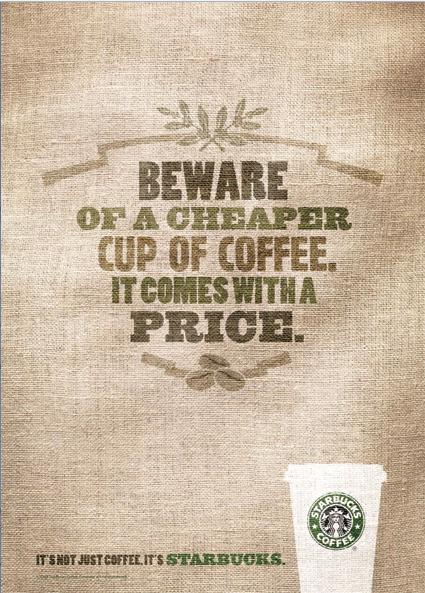
These new ads feature a rough, brown, sackcloth texture. Rectangular in their design, the focus of the ads is not mouthwatering beverages, but words. These words blend into the sackcloth, as though printed onto a bag. With phrases like, "Beware of a cheaper cup of coffee. It comes with a price," and, "If your coffee isn't perfect, we'll make it over. If it's still not perfect, make sure you're in a Starbucks." The words are positioned in the center of the ad, and are balanced. Colors are added to the words, but they are faded shades of greens and browns. The tagline at the bottom of the posters state, "It's not just coffee. It's Starbucks." A white coffee cup with the Starbucks logo is located on the bottom right hand corner of the advertisement.


While the new line of Starbucks advertisements follow the basic premises of design, they are not very effective. Granted, the posters are balanced, and the eyes are drawn to the center of the advertisement, but there is nothing in the ads to capture people's attention. Text is one of the sole shapes employed in the design. The colors are dull. Gone are the images of Starbucks' delicious coffees, teas, and hot chocolate. Coffee is replaced by sackcloth and words.


Sometimes an image is worth a thousand words. In this case, words alone are not enough to appeal to Starbucks' customers. Reading about superior coffee does not evoke the same sensation as looking at a steaming Pumpkin Spice latte. The new ad campaign is lacking in several ares. There is no great contrast in the design layout, and the advertisement does not entice the targeted audience to purchase Starbucks' coffee.


Rather than using bland posters with faded words to entice people to purchase their products, Starbucks' ad campaign would be more successful if they would create posters infused with tantalizing images of beverages. Contrast and color are also wonderful elements of design and very effective in advertisements. They would not have to eliminate text completely, but they should balance words with images. By adding color, contrast, and images of their product, Starbucks ads would have more depth and the result would be much more attractive.


For instance, a good poster design for Starbucks would feature a mouthwatering image of a frappuchino, with a mountain of swirled whipped cream drizzled with chocolate and sprinkled with coffee grounds. This could be located on the right side of the poster, and balanced with a bit of text. The background should complement both the text and the image, creating depth in the design and adding to the unity of the whole poster. This type of advertisement is much more effective because it triggers a response. When people view an alluring image, the object being portrayed conjures up cravings that, once stirred, are difficult to dismiss. And when the images are coupled with tasteful design, the urge is even more powerful.