The company's design is simple, yet classic. It encapsulates Starbucks' sophisticated image. Rather than opting for the typical rectangular sign, the Starbucks logo stands out like a beacon because of its unique design. It incorporates the fundamental elements of design: contrast, color, balance, the use of shapes, unity, and harmony.
These concepts are essential to good design. The center of the Starbucks' logo features a black and white mermaid with long, flowing hair. She is crowned, and a white star rests upon her head. Portions of her fins are visible in the background, and the image is completely symmetrical. Surrounding the radial image are the words 'Starbucks Coffee,' printed in white and set on a circular background of deep forest green. 'Starbucks' rests on the top half of the outline, while 'Coffee' rests on the bottom, and the font is wrapped so it matches the curve of the design. Two white stars separate the words, adding balance to the logo.
The mermaid pays homage to the roots of the company, as it represents the northwest coast of Seattle. The Starbucks logo is a classic emblem, conveying information by incorporating text into the design. The word 'coffee' immediately identifies Starbucks as a company that offers a rich, indulgent beverage. By choosing a circle to represent their company, rather than a rectangle, square, or any other shape, Starbucks is emphasizing wholeness, peace, and happiness. The use of balance in the logo adds to the unity and harmony of the piece. The design is not fragmented in any way, and strongly conveys meaning to its intended audience.
Starbucks advertisements reflect the balance and unity for which the company is known. They promise customer satisfaction, and draw people in by incorporating images of tantalizing beverages and similar product offered. Their motto is simple: we are coffee. They desire their customers to associate the word coffee with Starbucks. Customers and the general public have responded, and as a result, coffee and Starbucks have become synonymous. It is in their logo: Starbucks [is] Coffee.
Recently, however, Starbucks has deviated from their initial form of advertisement. Due to competition sparked by companies like McDonalds and Dunkin' Doughnuts, Starbucks began employing a new advertising strategy. In an effort to draw their waning customer base back, Starbucks released a new series of ads.

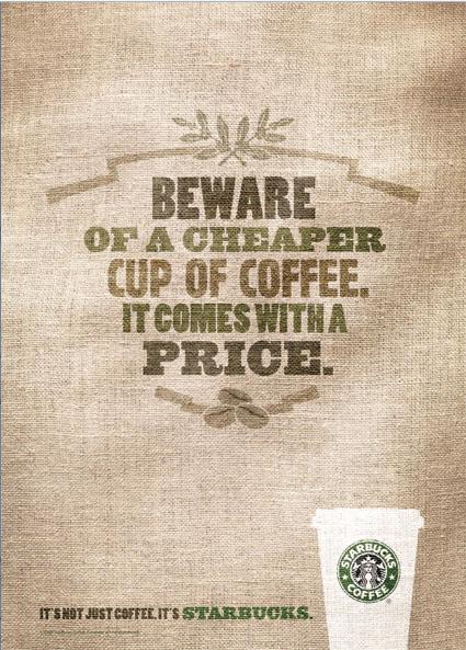
These new ads feature a rough, brown, sackcloth texture. Rectangular in their design, the focus of the ads is not mouthwatering beverages, but words. These words blend into the sackcloth, as though printed onto a bag. With phrases like, "Beware of a cheaper cup of coffee. It comes with a price," and, "If your coffee isn't perfect, we'll make it over. If it's still not perfect, make sure you're in a Starbucks." The words are positioned in the center of the ad, and are balanced. Colors are added to the words, but they are faded shades of greens and browns. The tagline at the bottom of the posters state, "It's not just coffee. It's Starbucks." A white coffee cup with the Starbucks logo is located on the bottom right hand corner of the advertisement.
While the new line of Starbucks advertisements follow the basic premises of design, they are not very effective. Granted, the posters are balanced, and the eyes are drawn to the center of the advertisement, but there is nothing in the ads to capture people's attention. Text is one of the sole shapes employed in the design. The colors are dull. Gone are the images of Starbucks' delicious coffees, teas, and hot chocolate. Coffee is replaced by sackcloth and words.
Sometimes an image is worth a thousand words. In this case, words alone are not enough to appeal to Starbucks' customers. Reading about superior coffee does not evoke the same sensation as looking at a steaming Pumpkin Spice latte. The new ad campaign is lacking in several ares. There is no great contrast in the design layout, and the advertisement does not entice the targeted audience to purchase Starbucks' coffee.
Rather than using bland posters with faded words to entice people to purchase their products, Starbucks' ad campaign would be more successful if they would create posters infused with tantalizing images of beverages. Contrast and color are also wonderful elements of design and very effective in advertisements. They would not have to eliminate text completely, but they should balance words with images. By adding color, contrast, and images of their product, Starbucks ads would have more depth and the result would be much more attractive.
For instance, a good poster design for Starbucks would feature a mouthwatering image of a frappuchino, with a mountain of swirled whipped cream drizzled with chocolate and sprinkled with coffee grounds. This could be located on the right side of the poster, and balanced with a bit of text. The background should complement both the text and the image, creating depth in the design and adding to the unity of the whole poster. This type of advertisement is much more effective because it triggers a response. When people view an alluring image, the object being portrayed conjures up cravings that, once stirred, are difficult to dismiss. And when the images are coupled with tasteful design, the urge is even more powerful.
Kelsey, It is always a joy to read your writings. I think connected with Starbucks beverages is also the concept of sitting in soft chairs, jazz playing in the background and working at a computer or reading. That's what I think when I see their logo. McD's still conveys "Fast in, fast out", nothing relaxing. I agree that the burlap sacks doesn't convey the normal Starbucks feel.
ReplyDeleteMrs. Enas
Mrs. Enas, Thank you so much for your comment:) I am excited that people are actually reading these... Sometimes I find it difficult to come up with interesting posts. This was actually part of a midterm paper that I submitted for another class - it fit well in my blog.
ReplyDelete